Commercial Colour Consulting Projects > Whiteside Project
 The Whiteside Project The Whiteside Project
Colour Theory…… colour consultants, Toronto
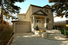
This is one of our favorite projects. The home is on the bluffs in Scarborough, near Toronto, Canada. The original structure on this property was a small post-war bungalow nestled in the centre of a large property.
The concept for the new structure was the work of Somerson Design-Build in Toronto. Barry Whiteside, principle of Somerson Design-Build saw the potential of a grand home in that location. The new structure is a 3000 square foot, 5 bedroom, 4 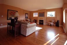 bath home. As an experienced builder, Whiteside had the forsight to protect and maintain the mature trees on the property. bath home. As an experienced builder, Whiteside had the forsight to protect and maintain the mature trees on the property.
 Somerson Design-Build brought us in as colour consultants at the beginning.
The first thing to work on was the exterior materials’ selection. We worked with various stucco and stone siding combinations. Once the siding colours were established, roofing came next. The newer multi-dimensional shingle type is the new ‘bar’ when it comes to roofing. Now colour and texture are both important to the overall look of a roof. We selected a tone to mimic old cedar shakes & to compliment the stone & stucco siding. Somerson Design-Build brought us in as colour consultants at the beginning.
The first thing to work on was the exterior materials’ selection. We worked with various stucco and stone siding combinations. Once the siding colours were established, roofing came next. The newer multi-dimensional shingle type is the new ‘bar’ when it comes to roofing. Now colour and texture are both important to the overall look of a roof. We selected a tone to mimic old cedar shakes & to compliment the stone & stucco siding.
 For eavestroughs, downspouts & soffits we picked a dark tone to frame the roof & finish with a subtle trim. The best thing aluminum accessories can do is blend in & disappear! For eavestroughs, downspouts & soffits we picked a dark tone to frame the roof & finish with a subtle trim. The best thing aluminum accessories can do is blend in & disappear!
Exterior paint colours were next… trim, garage door, porch details, etc. The hard landscaping colour was chosen to blend with the stone siding as well. Whiteside worked with a landscape designer to achieve the grand entrance to this house & exhibit it’s elegance.
 Once the materials for the exterior were established & the interior walls were framed & drywalled, we turned our focus to the interior paint colours. Whiteside’s vision was for a classic elegant home and all materials & colours were selected with that in mind. Once the materials for the exterior were established & the interior walls were framed & drywalled, we turned our focus to the interior paint colours. Whiteside’s vision was for a classic elegant home and all materials & colours were selected with that in mind.
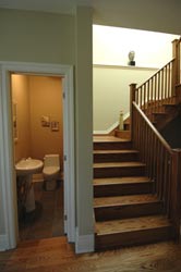
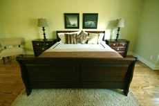
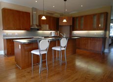
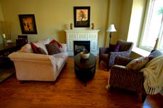
The interior paint colour palette needed to be warm, rich and understated. The hardwood that covers most of the floor and creates the beautiful staircase was the first colour to choose. We felt the stain colour should be rich but not too dark… and definitely not light as it wouldn’t have suited the architecture. Aside from the wood flooring, we put in a simple dark brown marble in the foyer, and neutral, natural looking porcelain tiles in the bathrooms & mud room.
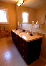 Countertops in the bathrooms are marble with dark wood cabinetry. We kept the bath wall tiles light & airy to maximize natural light. Countertops in the bathrooms are marble with dark wood cabinetry. We kept the bath wall tiles light & airy to maximize natural light.
The final choices were the interior paint colours. Working with such an elegant interior we felt it was important that the colours be subtle. All colours selected have warmth & character but they get the point across. The main floor has a lot of earthtones, but the bedrooms are aquas and greens. These tones help elevate the overall effect & balance out the brown tones in the wood. They are also very restful.
 On the part of Whiteside & all his tradespeople (including us!) a lot of work & careful thought went into this project. On the part of Whiteside & all his tradespeople (including us!) a lot of work & careful thought went into this project.
Finally, after each fireplace, each bit of crown molding, each lighting fixture & each doorknob had been installed….the home was finished … and beautiful!
Check out other commercial colour consulting projects
Arimar Townhouse Colour Cosultation Project
Forest Laneway Exterior Colour Selection
Magic Moments Daycare Project
Contact: sylviaobrien@colourtheory.net | Telephone: 416·766·6789
Home | Commercial Projects | Residential Projects | Contact Us | Sitemap
Copyright© 2003-2011 Colour Theory. All Rights Reserved.
|